
Tranquilo Sunrise Industries
Challenge:
A lifestyle brand from Santa Barbara, CA commissioned a logo and branded packaging to go with their growing CBD-isolate business. The new logo needed to be able to stand out on a shelf but the client also wanted incorporation of some reference to cannabis and an indication of potency, as the CBD level in these products are among the highest on the market.
Solution:
For the logo design I chose to work around the cannabis leaf as a starting point, making it into a sunrise. However, it’s not a consistent design. The leaf sunrise has a subtle increasing effect from left to right to create a subliminal connection to onset of medicinal properties and a play on the connection with a sunrise’s continuous increase in intensity.
![]()
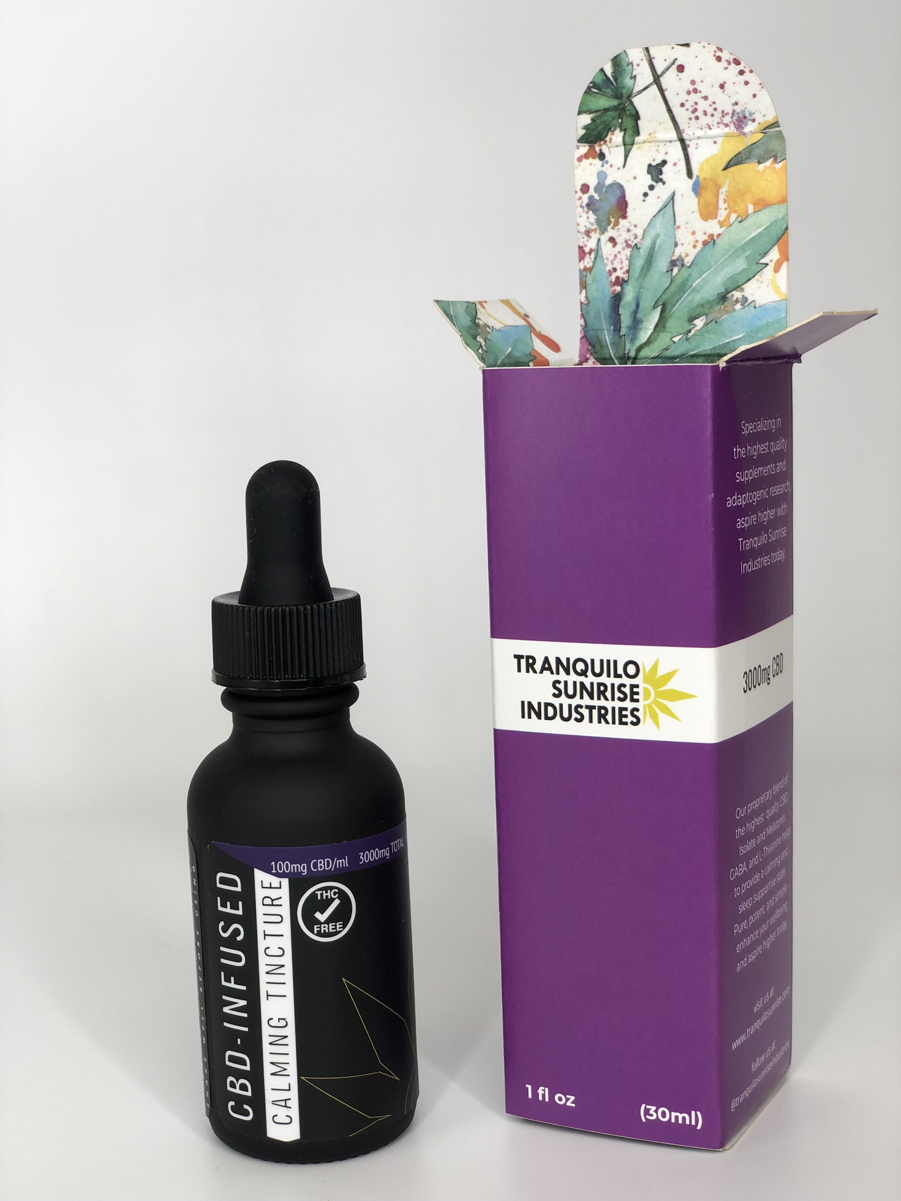
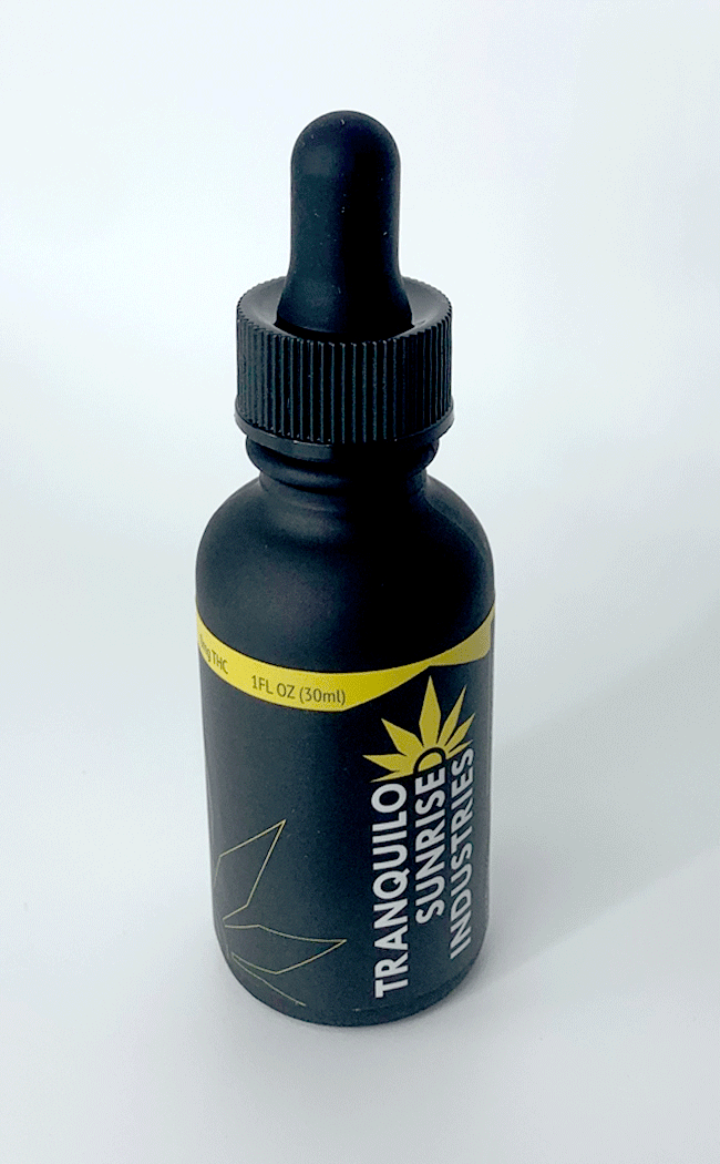
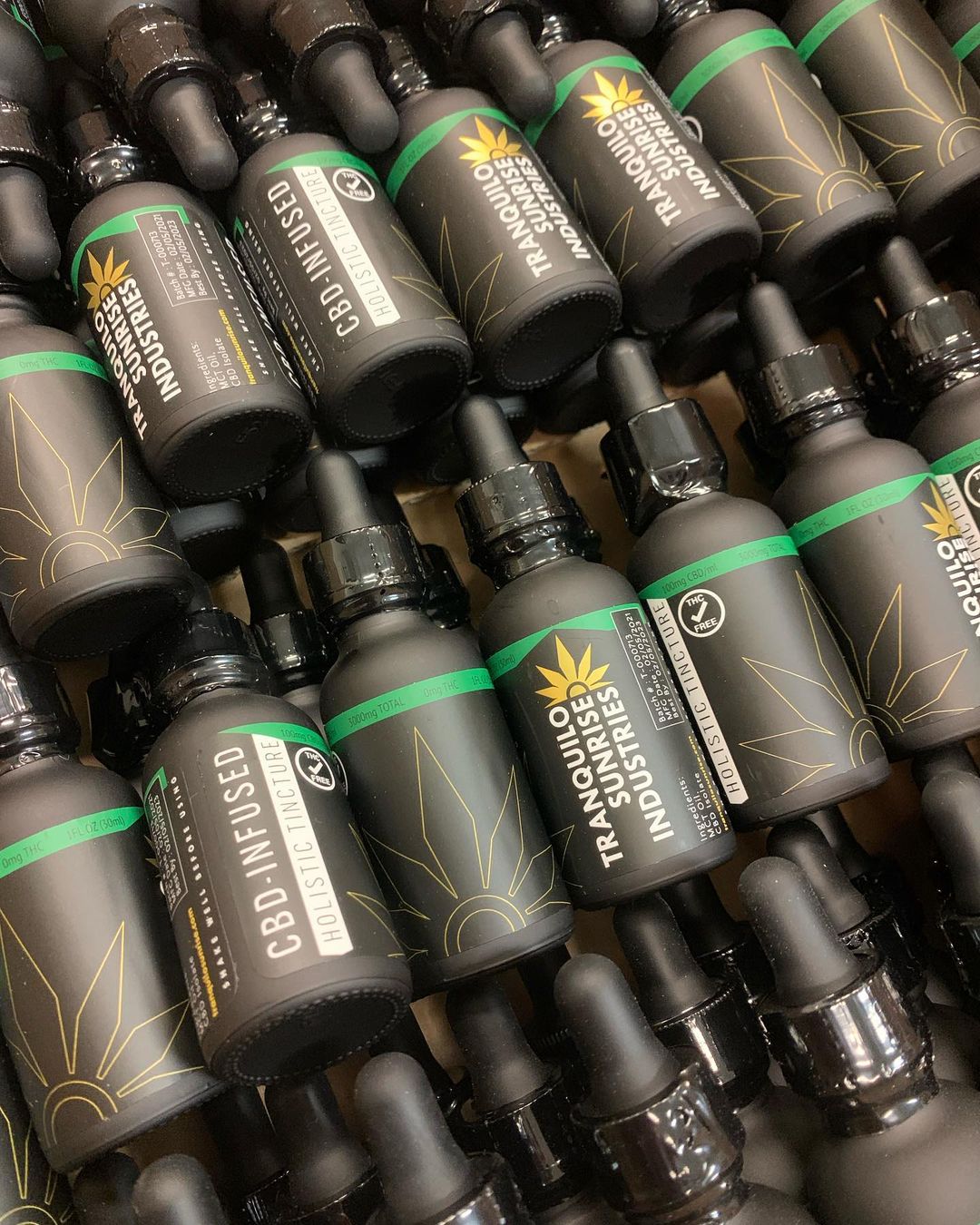
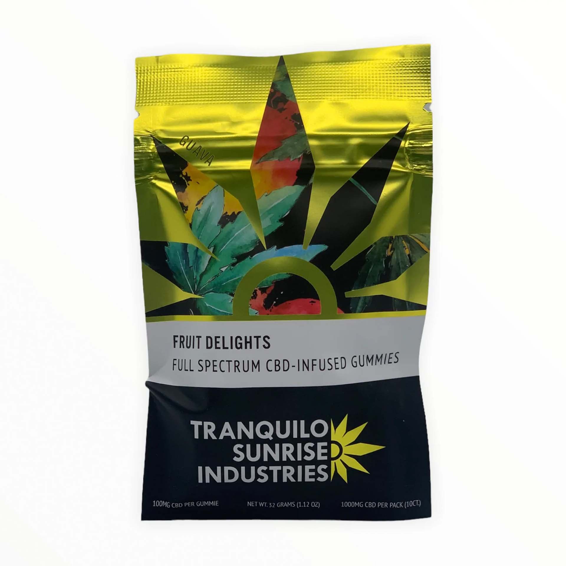
Branding
Challenge:
The client had preselected several multi-colored stock patterns and was insistent that they be incorporated somehow into the new packaging designs.
Solution:
I worked with metallic effects where available to increase the shelf-appeal of the the packaging and make the patterns stand out with maximum contrast and vibrancy. Since the patterns had a wide range of colors I developed a method that worked for each package to provide uniqueness in presenting the pattern while also maintaining a consistent look across all the pieces.

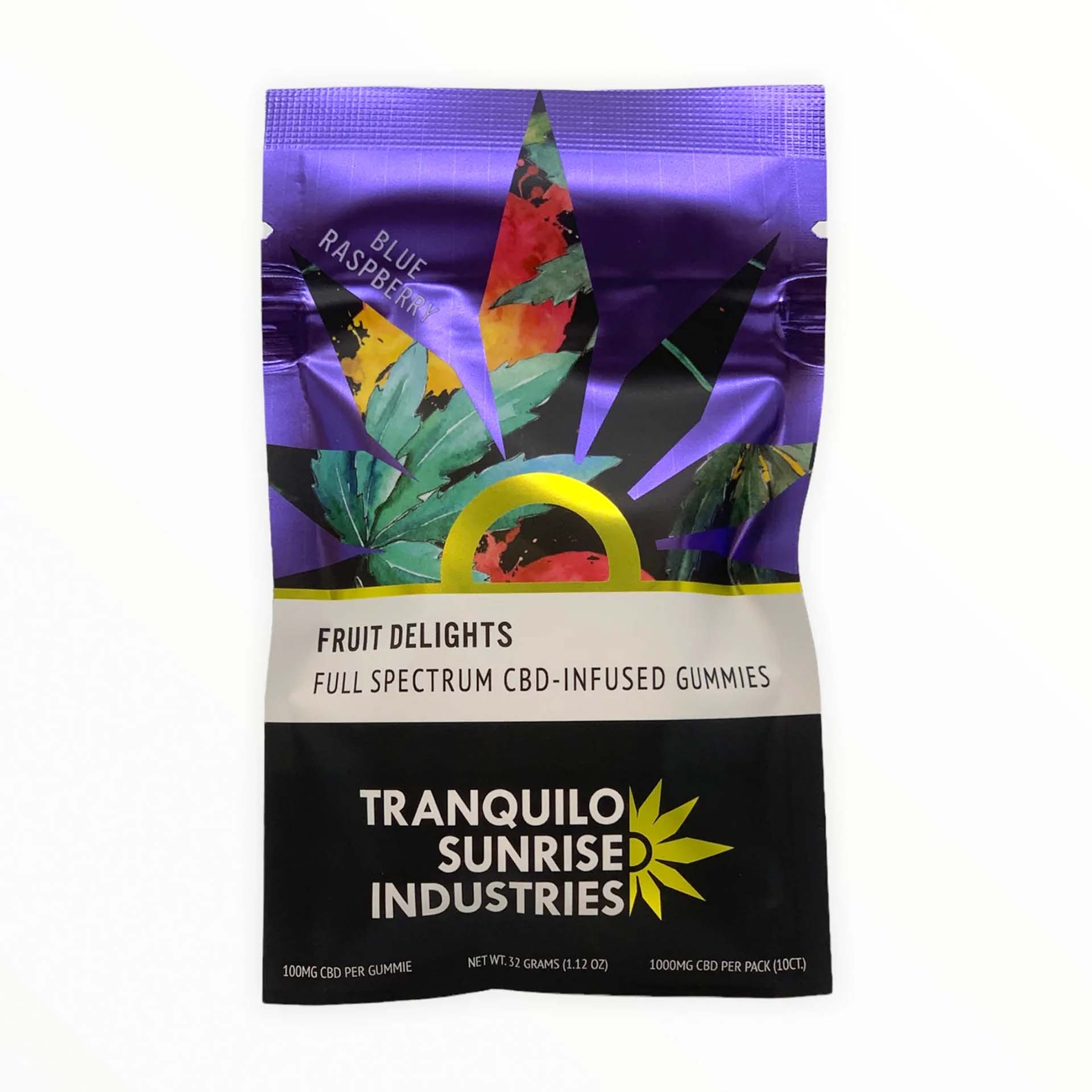
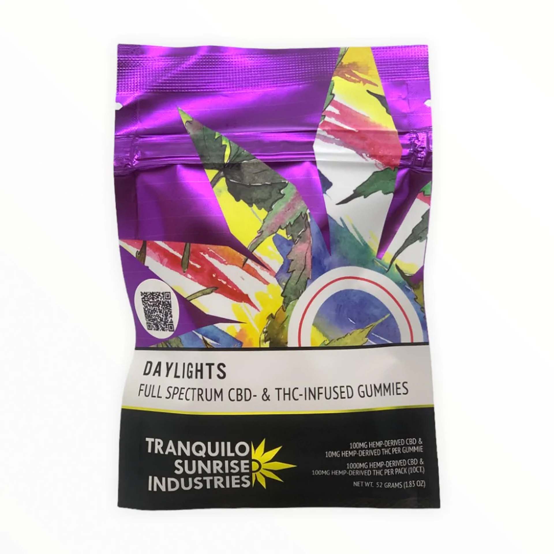
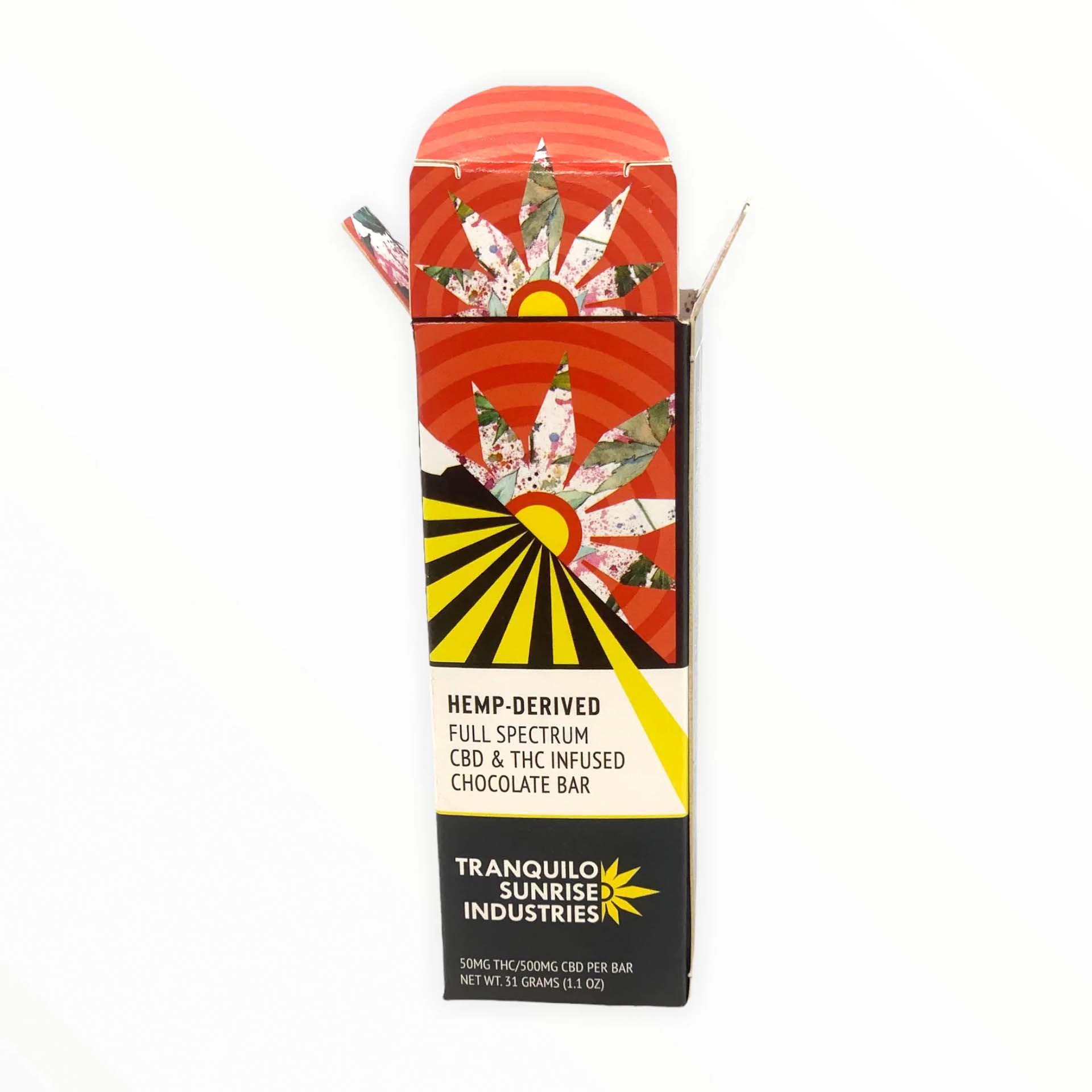

Custom labels were created for their tinctures with metallic gold effects in the logo other elements in the design. The effect is subtle in photos but vibrant and chic in person.